

Creating a web page or dashboard can be done using R with the Shiny package. Another way to do this is by using HTML, CSS, and Javascript, or called web programming languages. But, R can replace most of the basic functions of web programming in making a dashboard.
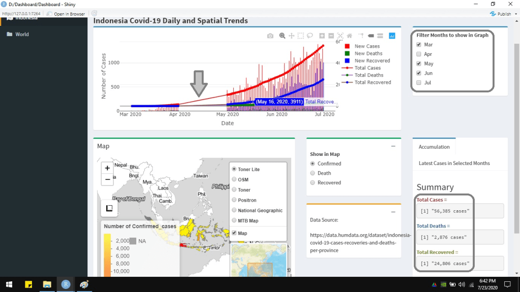
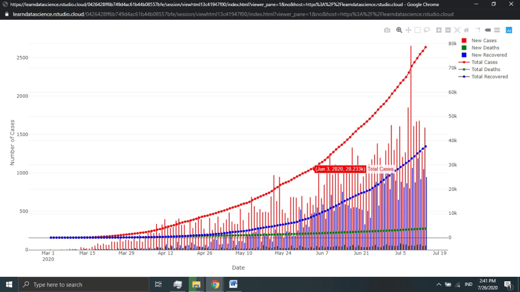
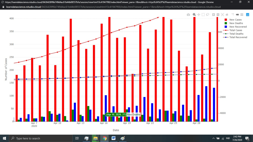
This article describes a simple interactive dashboard developed using R, incorporating a few programming languages. The dataset is Covid19 cases happening in Indonesia from March 2020 until mid-July 2020. The chart shows the time series of Covid19 cases: total cases, death cases, recovered cases, new cases, new deaths, and new recovered. It is interactive because the chart is made using Plotly package. Hover the pointer there, and it will show the individual bar or line information. Ggplot is not interactive like this. The chart is also reactive. Users can set which months to show on the graph from the checkboxes.

The dashboard is developed using User Interface (UI) and server. UI builds how the dashboard looks like. The dashboard above is made using dashboardPage. Another way to create it is by using fluidPage. The server makes the reactivity. In the dashboard above, the contents of the chart, map, checkboxes, radio buttons, and text are arranged in the UI. The server manages the reactivity of how charts and map are displayed according to checkboxes, radio buttons, or others.
#library("tidyr")
#library("readxl")
#library("dplyr")
#library("shiny")
#library("shinydashboard")
#library("plotly")
#library("htmltools")
#library("leaflet")
#library("rgdal")
#library("sp")
# Read from EXcel
Daily <- read_excel("D:/2. Blogging/1 Artikel/Dashboard/DailyCovid.xlsx", sheet = "Daily", col_names = TRUE)
Daily <- Daily %>% mutate(DateChar = format(Daily$Date, format="%d-%b-%Y"))
Daily <- Daily %>% mutate(Month = format(Daily$Date, format="%b"))
dataSource <- "https://data.humdata.org/dataset/indonesia-covid-19-cases-recoveries-and-deaths-per-province"
Prov <- read_excel("D:/2. Blogging/1 Artikel/Dashboard/ProvinceCovid.xlsx", sheet = "Provinces", col_names = TRUE)
Prov <- Prov %>% gather("Cases", "Value",-Province_name)
names(Prov)[1] <- "Province"
#
# create header here----
header <- dashboardHeader(title = "Indonesia Covid-19 Dashboard")
# create sidebar here----
sidebar <- dashboardSidebar(
  sidebarMenu(
    menuItem("Indonesia", tabName = "covid", icon = icon("map-marked-alt")),
    menuItem("World", tabName = "World", icon = icon("folder"))
  ))
# create body here----
body <- dashboardBody(
  # Create a tabBox
  tabItems(
    # Tab 1------
    tabItem(tabName = "covid", tags$div(HTML("<b> <span style=font-size:150%;> Indonesia Covid-19 Daily and Spatial Trends </span> </b>")),
            fluidRow(
              column(width=9, height = 250,
                     box(width = NULL, status = "primary",
                         plotlyOutput("chart1", height = 250)
                     )),
              column(width=3,
                     box(width = NULL, status = "primary", collapsible = FALSE,
                         checkboxGroupInput(inputId="showGraph", label="Filter Months to show in Graph",inline = FALSE,
                                            choices=list("Mar"="Mar", "Apr"="Apr", "May"="May",
                                                         "Jun"="Jun", "Jul"="Jul"),
                                            selected=c("Mar", "Apr", "May", "Jun", "Jul" ))))
            ),
            fluidRow(
              column(width=6, height = 400,
                     box(title = "Map", width = NULL, status = "success",
                         leafletOutput("map", height = 400)
                     )),
              column(width=3,
                     box(width = NULL, status = "success", collapsible = TRUE,
                         radioButtons(inputId="showMap", label="Show in Map",
                                      choices = list("Confirmed"="Confirmed_cases",
                                                     "Death"="Death_cases",
                                                     "Recovered"="Recovered_cases"),
                                      selected = c("Confirmed_cases"),
                                      inline = FALSE, width = NULL)),
                     box(width= NULL, status = "warning", collapsible = TRUE,
                         "Data Source:",
                         tags$div(HTML('<br>')),
                         tags$div(HTML(dataSource)))),
              column(width=3,
                     tabBox(width = NULL, height = 300,
                            tabPanel("Accumulation",
                                     tags$div(HTML("<b> <h3> Summary </h3> </b>")),
                                     tags$div(HTML("<b> <span style='color:#963634;'> Total Cases =  </span> </b>")),
                                     verbatimTextOutput("tCase"),
                                     tags$div(HTML("<b> <span style='color:#365f92;'> Total Deaths =  </span> </b>")),
                                     verbatimTextOutput("tDeath"),
                                     tags$div(HTML("<b> <span style='color:#76933c;'> Total Recovered =  </span> </b>")),
                                     verbatimTextOutput("tRecovered")),
                            tabPanel("Latest Cases in Selected Months",
                                     tags$div(HTML("<b> <h3> Summary </h3> </b>")),
                                     tags$div(HTML("<b> <span style='color:#963634;'> Latest Cases =  </span> </b>")),
                                     verbatimTextOutput("nCase"),
                                     tags$div(HTML("<b> <span style='color:#365f92;'> Latest Deaths =  </span> </b>")),
                                     verbatimTextOutput("nDeath"),
                                     tags$div(HTML("<b> <span style='color:#76933c;'> Latest Recovered =  </span> </b>")),
                                     verbatimTextOutput("nRecovered")
                            )))
            )
    ),
    # tab 2----
    tabItem(tabName="World",
            "not yet done")
  )
)
# Display----
ui <- dashboardPage(header, sidebar, body, skin='yellow')
server <- function(input, output, session) {}
shinyApp(ui, server)
As mentioned before, the top right checkboxes control which months to show in the chart. Below the checkboxes, there is a tabBox containing 2 tabPanels. TabBox can show more than one information in tabPanels in turn. It shows the summary of total accumulated cases in the first tabPanel and the latest number of cases in the second tabPanel. The accumulated and latest cases in which months to show can be set by the user too.
Notice that the chart changes according to which months the user checks the checkboxes. The numbers of cases, shown in the right bottom, also change. If “Apr” and “Jul” are unchecked, the chart does not show those two months data. The total accumulated and latest cases also summarize only the data until June, excluding April and July.

server <- function(input, output, session) {

  # Bar and Line Chart
  output$chart1 <- renderPlotly({
    month_check <- c()
    month_check <- input$showGraph

    Daily2 <- Daily %>% filter(Month %in% month_check)

    xform <- list(categoryorder = "array",
                  categoryarray = Daily2$Date)

    ay <- list(
      overlaying = "y",
      side = "right")

    chart1 <- plot_ly(data=Daily2, x=~Date, y=~New_Cases, type='bar', name="New Cases", marker=list(color="red")) %>%
      add_trace(y=~New_Deaths, type="bar", name="New Deaths", marker=list(color="green")) %>%
      add_trace(y=~New_Recovered, type="bar", name="New Recovered", marker=list(color="blue")) %>%
      add_trace(y=~Total_Cases, type = 'scatter', mode = 'lines', name='Total Cases', marker=list(color="red"), yaxis="y2" ) %>%
      add_trace(y=~Total_Deaths, type = 'scatter', mode = 'lines', name='Total Deaths', marker=list(color="green"), yaxis="y2" ) %>%
      add_trace(y=~Total_Recovered, type = 'scatter', mode = 'lines', name='Total Recovered', marker=list(color="blue"), yaxis="y2" ) %>%
      layout(xaxis = xform, yaxis2=ay, yaxis=list(title="Number of Cases"))

    chart1
  })


  # total case
  output$tCase <- renderPrint({
    month_check <- c()
    month_check <- input$showGraph

    MaxDate <- Daily %>% filter(Month %in% month_check) %>%
      summarise(Date = max(Date, na.rm = TRUE))

    Daily2 <- Daily %>%filter(Date == MaxDate$Date)

    total <- format(round(Daily2$Total_Cases,0), big.mark=",", nsmall=0)

    total <- paste(total, " cases", sep="")

    total
  })

  # total death
  output$tDeath <- renderPrint({
    month_check <- c()
    month_check <- input$showGraph

    MaxDate <- Daily %>% filter(Month %in% month_check) %>%
      summarise(Date = max(Date, na.rm = TRUE))

    Daily2 <- Daily %>%filter(Date == MaxDate$Date)

    total <- format(round(Daily2$Total_Deaths,0), big.mark=",", nsmall=0)

    total <- paste(total, " cases", sep="")

    total
  })

  # total recovered
  output$tRecovered <- renderPrint({
    month_check <- c()
    month_check <- input$showGraph

    MaxDate <- Daily %>% filter(Month %in% month_check) %>%
      summarise(Date = max(Date, na.rm = TRUE))

    Daily2 <- Daily %>%filter(Date == MaxDate$Date)

    total <- format(round(Daily2$Total_Recovered,0), big.mark=",", nsmall=0)

    total <- paste(total, " cases", sep="")

    total
  })

  # new case
  output$nCase <- renderPrint({
    month_check <- c()
    month_check <- input$showGraph

    MaxDate <- Daily %>% filter(Month %in% month_check) %>%
      summarise(Date = max(Date, na.rm = TRUE))

    Daily2 <- Daily %>%filter(Date == MaxDate$Date)

    latest <- format(round(Daily2$New_Cases,0), big.mark=",", nsmall=0)

    latest <- paste(latest, " cases", sep="")

    latest
  })

  # new death
  output$nDeath <- renderPrint({
    month_check <- c()
    month_check <- input$showGraph

    MaxDate <- Daily %>% filter(Month %in% month_check) %>%
      summarise(Date = max(Date, na.rm = TRUE))

    Daily2 <- Daily %>%filter(Date == MaxDate$Date)

    latest <- format(round(Daily2$New_Deaths,0), big.mark=",", nsmall=0)

    latest <- paste(latest, " cases", sep="")

    latest
  })

  # new recovered
  output$nRecovered <- renderPrint({
    month_check <- c()
    month_check <- input$showGraph

    MaxDate <- Daily %>% filter(Month %in% month_check) %>%
      summarise(Date = max(Date, na.rm = TRUE))

    Daily2 <- Daily %>%filter(Date == MaxDate$Date)

    latest <- format(round(Daily2$New_Recovered,0), big.mark=",", nsmall=0)

    latest <- paste(latest, " cases", sep="")

    latest
  })


}


The following is the chart displayed separatedly, not in the dashboard. It is to show the chart more clearly.
The text in the tabPanels as seen in the script above is made by HTML and CSS. HTML (Hypertext Markup Language) builds the structure of the web page or dashboard. Or, in this dashboard, HTML is used to arrange the text in the tabBox. CSS (Cascading Style Sheets) creates the style for the content. CSS in the tabBox defines the colors to the text. Besides HTML and CSS, Javascript is another web programming language. Javascript gives the behavior to the web page or dashboard. An example of Javascript is for creating a button to show or hide data source (used to plot the chart and map in the dashboard).

# data souce
dataSource <- HTML(
  '<!DOCTYPE html>
  <html>
  <body>

  <button onclick="showFunction()">Click to show data source</button>
  <button onclick="noshow()">Click to hide data source</button>

  <p id="source"></p>

  <script>
  function showFunction() {
  document.getElementById("source").innerHTML = "https://data.humdata.org/dataset/indonesia-covid-19-cases-recoveries-and-deaths-per-province";
  }

  function noshow() {
  document.getElementById("source").innerHTML = "";
  }
  </script>

  </body>
  </html>
')
The interactive map shows the number of total cases, death cases, and recovered cases by province. The radio buttons positioned right beside the map are used to control which type of cases to show on the map. The map is created using a leaflet. It has zoom-in and zoom-out buttons, measurement tool, legends, layer control, and inset map.
 # Spatial map
  output$map <- renderLeaflet({
    #shpMap_ <- readOGR("D:/2. Blogging/1 Artikel/Dashboard/shpProv/Provinces.shp")
    # projection
    shpMap <- spTransform(shpMap_, CRS("+proj=longlat +datum=WGS84"))

    MapProvince <- data.frame(shpMap$Province)
    colnames(MapProvince) <- "Province"

    # Read tabular data
    cases_check <- c()
    cases_check <- input$showMap

    Prov2 <- Prov %>% filter(Cases %in% cases_check)

    # joining spatial and tabular data
    MapProvince2 <- left_join(MapProvince, Prov2, by = "Province")

    #formatting the value
    MapProvince2 <- MapProvince2 %>% mutate(ValueChar = format(round(MapProvince2$Value,0), big.mark = ",", nsmall = 0))

    # set colors
    pal <- colorNumeric(
      palette = c("#FFFF00", "#ff8000", "#FF0000"),
      domain = MapProvince2$Value)

    labels <- sprintf(
      "<strong>%s</strong> <br>Number of cases: %s people",
      MapProvince2$Province, MapProvince2$ValueChar) %>%
      lapply(htmltools::HTML)

    map <- leaflet(shpMap) %>%
      addTiles(group = "OSM") %>%
      addProviderTiles(providers$Stamen.Toner, group = "Toner") %>%
      addProviderTiles(providers$Stamen.TonerLite, group = "Toner Lite") %>%
      addProviderTiles(providers$CartoDB.Positron, group = "Positron") %>%
      addProviderTiles(providers$Esri.NatGeoWorldMap, group = "National Geographic")%>%
      addProviderTiles(providers$MtbMap, group = "MTB Map") %>%
      addProviderTiles(providers$Stamen.TonerLines,
                       options = providerTileOptions(opacity = 0.35), group = "MTB Map") %>%
      addProviderTiles(providers$Stamen.TonerLabels, group = "MTB Map")%>%
      addPolygons(stroke = TRUE, smoothFactor = 0.2, fillOpacity = 1,
                  fillColor = ~pal(MapProvince2$Value),
                  weight = 1,
                  opacity = 1,
                  color = "grey",
                  dashArray = "3",
                  group = "Map",
                  highlight = highlightOptions(
                    weight = 2,
                    color = "#666",
                    dashArray = "",
                    fillOpacity = 0.7,
                    bringToFront = TRUE),
                  label = labels,
                  labelOptions = labelOptions(
                    style = list("font-weight" = "normal", padding = "3px 8px"),
                    textsize = "15px",
                    direction = "auto"),
                  popup= labels
      ) %>%
      addLegend(pal = pal, values = ~MapProvince2$Value, opacity = 0.7, title = paste("Number of ", input$showMap, sep=""),
                position = "bottomleft") %>%
      addLayersControl(
        baseGroups = c("Toner Lite", "OSM", "Toner", "Positron", "National Geographic", "MTB Map"),
        overlayGroups = c("Map"),
        options = layersControlOptions(collapsed = FALSE))%>%
      addMeasure(position = "bottomleft",
                 primaryLengthUnit = "meters",
                 primaryAreaUnit = "sqmeters",
                 activeColor = "#3D535D",
                 completedColor = "#7D4479") %>%
      addMiniMap(
        tiles = providers$Esri.WorldStreetMap,
        toggleDisplay = TRUE)

    map
  })


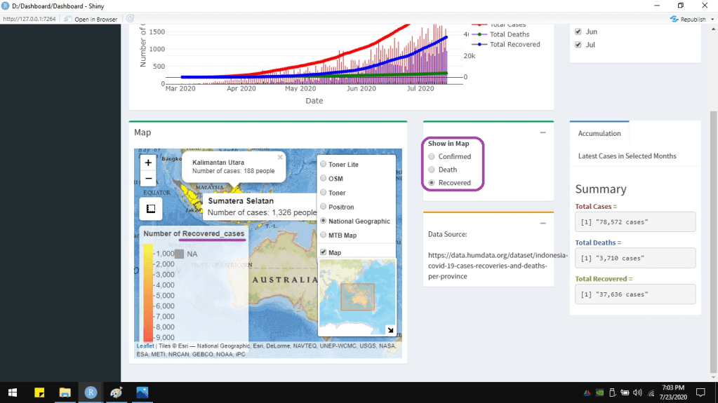
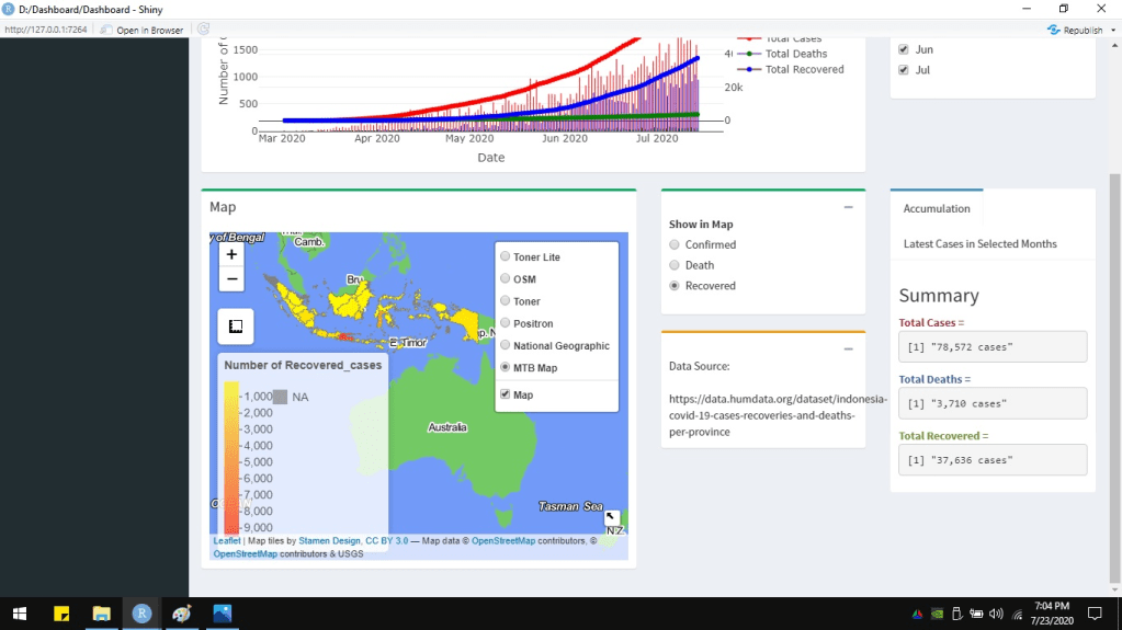
The data of each province will show up if the pointer hovers on it. If the province is clicked, it will give a popup message. Below is the leaflet map displayed separately from the dashboard to show more clearly.


